Reading Reflection 7

Cooper. (2007). About Face 3.
Chapter 7

In Chapter 7 of his book, Cooper talks about taking the requirements from scenarios and using them to design. The designer needs to decide on what form the design will take, how it will be used, the input methods of the users, and elements and functions that are to be included. This is done by using information from previous stages and applying design principles to create low-fidelity models. It makes sense that detailed designs are to be avoided at this time, and I liked Cooper’s suggestion of using whiteboards to sketch and cameras to capture ideas for reference.

In general, the Framework phase is about defining the tone and types of interactions that will be in the design. The line between what you should focus on and the detail you should not include was different from what I had guessed, but Cooper does a decent job of defining it. I had thought something such as “visual language studies” would be saved for the refinement phase, but if this phase is focusing on the overall tone, then I suppose it would be included.

Sharp, Rogers, & Preece. (2007). Interaction Design.
Chapter 11: Design, prototyping, and construction

Other than the overall topic, this reading was similar to Coopers in various ways. They both discussed speaking with stakeholders about your ideas, understanding the interactions and functions you will include before designing, and considering interfaces to set the tone and suggest possible behaviors. One similarity that really stood out to me was the advantage of using low-fidelity prototypes – it not only is cost efficient and quick, but causes the designer to focus more on functions and user goals than pixels and widget design.

The chapter described low-fidelity prototypes as representations that doesn’t use any of the actual materials that would be on the final product. This reminded me of the Art and Design course I took last year where my partner and I made a prototype washing machine built from cardboard, Styrofoam, paper, tape, and a yoga ball. It was not at all what we intended the product to be, but it allowed us to test the dimensions of our design with actual people and target problems with it.

Reading Reflection 6

Paay, J. (2008). From ethnography to interface design.

I didn’t know much about ethnography before reading this article, but I thought it gave a great background on it and the relation to HCI. Obviously, I didn’t know that a gap existed between ethnography and interface design either, but the paper seemed to propose such a simplistic solution that I wonder if it is actually effective. Turning towards ethnography for a contextual understanding of technology seems like a smart move for a designer, since it enriches a user’s experience and provides answers to a design. It makes me wonder why such a gap still exists between the two, although I can understand how the translation could prove difficult. I guess it shows that moving from Research to Planning isn’t always easy.

I also thought this article gave an informative instruction on their design process.

Eysenbach, G., & Köhler, C. (2002). How do consumers search for and appraise health information on the world wide web? Qualitative study using focus groups, usability tests, and in-depth interviews.

This article reminded me about the one on information scent, partially because of the task searching and the medical information topic. What I most liked about this reading was the quotes from the focus groups and interviews about credibility. The participants mentioned several key items to consider when designing. It also shows that users will likely not continue on a site if it lacks perceived credibility.

Millen, D. (2000). Rapid ethnography: Time deepening strategies for HCI field research.

This paper posed many standing problems with ethnographic methods for HCI. While it may be a powerful way of obtaining research on your audience, I can understand how time does not always allow for such an extensive analysis. Rapid ethnography seems to provide an alternative to time-sensitive projects by “narrowing the focus of the field research”, using “multiple interactive observation techniques”, and using “collaborative and computerized iterative data analyze methods”. However, it does seem that many sources are recommended for it to succeed, such as field guides, corporate informants, various software, etc.

Cooper. (2007). About face 3.

Cooper’s Chapter 4 covers ways to conduct qualitative research, including ethnographic interviews. He suggests speaking with stakeholders and subject matter experts to identify candidates for interviews before actually conducting them. This way, the designer basically sets up a persona hypothesis and has a basic idea of the different behavior patters that will appear when researching. Cooper also touches briefly on other types of research such as focus groups, usability testing, card sorting, and task analysis – many of which we spoke of in class last week.

Reading Reflection 5

Brinck, T., Gergle, D., & Wood, S.D. (2002). Designing Web Sites That Work: Usability for the Web. Morgan Kaufman.

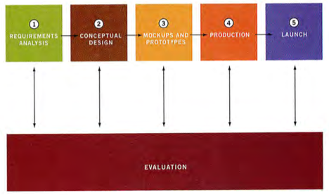
The chapter we had to read introduced the Pervasive Design Process:

Pervasive Design Process

I thought it seemed like a good basis for any project and very much relates to the Production Pipeline (CGT 581) course I’m currently taking. It also reminds me of Cooper’s similar (yet clearly different) Goal-Directed Design Process, which consists of six phases: Research, Modeling, Requirements, Framework Refinement, and Support.

There are definite overlaps in the two, such as speaking with your stakeholders or creating a requirements definition. I guess the major difference would be the introduction of personas in Cooper’s process. Brinck et al. also go more into detail on Resources (like budget and staff) than I recall Cooper doing.

This reading has some good advice; I especially appreciated the insight on how to decide on what method to use. It should prove useful to my own study.

Reading Reflection 4

Nielsen, J. (1999). Designing Web usability.

In summary, a home page should offer three features: a directory of the site’s main content areas (navigation), a summary of the most important news or promotions, and a search feature (p. 168).

I thought this chapter provided good tips concerning what is important for users to see when first looking at a site, and how to emphasize that information. There were a few examples of metaphors used in websites, where some succeed but most don’t. Also, I learned about the term “deep linking”. In addition, some of the tips on navigation I remember being mentioned in class. That is, you’re users should always be able to answer these questions: Where am I? Where have I been? Where can I go? However, I think color conventions of links have changed with changes on the Web. I don’t expect links to be underlined, blue, or purple, as Nielsen recommends. Instead, I merely look for some sort of difference or emphasis on the words.

Neilsen also goes in depth about tips for efficient search features. One concept that stood out to me was the fact that users are less likely to input more words when the search box is smaller. Funny how we restrict ourselves.

Reading Reflection 3

Cooper, A., Reimann, R., & Cronin, D. (2007). Implementation models and mental models, About face: The essentials of interaction design (27-40). Indianapolis: Wiley Publishing, Inc.

In Chapter 2, Cooper (2007) identifies the difference between an Implementation Model and a Mental Model. However, for designers there is another model called the Represented Model, where they must choose how to represent the working program. Cooper says that, “One of the most important goals of the designer should be to make the represented model match the mental model of users as closely as possible” (p. 30). Following other principles I’ve learned in design classes, it makes sense. After all, as a designer, you should design for your audience. If the mental model represents the user’s vision, then designers should create representations closer to that vision.

Cooper also talks about Mechanical-Age and Information-Age objects, where interfaces are sometimes limited by what we know and expect from the past. He suggests that any Mechanical-Age representations be improved on with Information-Age enhancements. It hadn’t really occurred to me, but I can see how designers can easily restrict themselves with what is already known. It seems that Information-Age enhancements need a little bit of thinking outside the box and innovation.

Fu, W., & Pirolli, P. (2007). SNIF-ACT: A cognitive model of user navigation on the World Wide Web. Human-Computer Interaction, 22, 355-412.

The authors that wrote this paper created a model aimed to predict user navigation on the Web and to understand the cognitive approach of users when navigating. They discovered that information scent cues (which is related to the relevance of link texts to user information goals) was a better predictor of navigation than position. Because their first model was based solely on information scent cues, they created a second one that took position into account, which ended up being a better predictor than the others.

The greatest concept I took from this was that users tend to “satisfice” when navigating. That is, after a brief time scanning a page, users will choose the link with the greatest information scent from only the select few that have been evaluated, rather than putting extra effort into finding the best link on the whole page.

I had known about satisfying before, but I think this was a good example of the concept, and that the authors’ findings really put it into perspective.

Nielsen, J. (2005). Jakob Nielsen’s online writings on heuristic evaluation. Retrieved from http://www.useit.com/papers/heuristic.

Nielsen covers several points on usability testing, namely focusing on Heuristic Evaluation and User Testing. Heuristic evaluation involves a small set of evaluators to examine an interface in terms of usability (3-5 people recommended). User testing involves an observer/experimenter that interprets user actions related to usability issues. He suggests using both since some problems can only be identified by one of them.

Nielsen also mentions severity of usability problems, which he defines as a combination of frequency, impact, and persistence. I didn’t know about severity ratings before reading this, but he suggests that all problems should be found first, then evaluators should rate them in terms of severity before scored are averaged.

The webpage also included an article on Technology Transfer that looked at the usability of usability methods. Nielsen found that user testing and heuristic evaluations were rated most useful because of that quality of data they generated. Newer methods also tended to be rated lower. Aside from the findings, I was glad to see mentioned that companies realize the need for increased usability.

Vorvoreanu, M. (2010). Understanding NSF investments: Heuristic evaluation.

The evaluation gave a great example of what Nielsen explained on his page, including usability principles and severity ratings. I personally haven’t seen any other heuristic evaluation reports, but this looked well organized and it was easy for me to follow along, especially with the snapshots. I noticed Dr. V went with her signature colors for the layout, too. 😉

Questions I have: Is this report what you show to clients? Or was this assembled for our class or a portfolio of some sort? I’m curious how the evaluation is used or what process you go through once the report is completed.
Reading Reflection 2

Gibson, J. (1998). A theory of direct visual perception.

I found this reading slightly difficult to follow and grasp the concepts that were being explained. Top-down and bottom-up processing seem very simple in theory, but this reading seemed to focus on information and perceiving that information. From what I took away from the reading was that there are principles of optics, and that we must sample and piece together information to form an environment because we cannot view everything at once. Another theory that stood out to me was the concept of depth perception. Gibson claims that it is not perceiving a third dimension but instead perceiving the layout of an environment.

Overall, Gibson had innovative ways of perceiving perception and how we process information. I thought the reading was a little hard to follow because the way it was written (why were so many word italicized?), but was still enlightening.

Chang, D., Dooley, L., & Tuovinen, J. Gestalt theory in visual screen design – A new look at an old subject.

This article was a good overview of the Gestalt principles, most of which I have already learned in another class at one point or another. I think they explained them well, with decent examples for visualization. I doubt this article was chosen for the findings because it seemed that all they did was reinforce the fact that Gestalt principles work.

El-Nasr, M., & Yan, S. Visual attention in 3D video games.

I thought this article was interesting in that they used eye tracking during gameplay to discover which type of processing was being used and had decent results to base their conclusions on. However, I do think it could be taken further due to their limitations.

I did notice that when they mentioned that only a couple of participants would notice items from the start, they did not say which category of gamer the player fell in. While I would assume the more experienced gamer would be more prone to find the exit sooner, I wonder if this was the case in their study. I think the result could give their conclusion a little more merit (but then again, only 6 participants were used).

Reading Reflection 1

Nielsen, J. (2000). Designing Web usability.

Nielsen provides a strong argument for the importance of web usability: That “users experience usability first and pay later” (Nielsen, 2000, p. 11). If they decide a website doesn’t instantly satisfy them, they’ll leave. Simple enough. Nielsen also makes a point from an engineering perspective that the main goal of creating a website is to make it easy for users to perform tasks. I wholeheartedly agree with his statements, and must say that it seems like a useful book to own, even having only read the first chapter. In only three pages he has given the reader several pointers in designing a web project, along with examples in which they can relate.

Tullis, T. & Albert, B. (2008). Measuring the user experience.

I had never heard the term “usability metrics” before this reading, however, (before I read the excerpt) I would have assumed it would be measurements taken to assess the usability of a product. This book seems to offer a lot in the way of what to measure, how, and what to do with the results, which should prove useful to my thesis.

There was also mention of formulas (which someone discourages me), although the book claims there are few. Although when I think about it, it is somewhat amazing that there even is such a formula to help identify if something can be regarded as “usable”. Or that usability can even be measured. It almost seems to be a subjective concept.

Other parts of the reading I found enlightening were the three definitions of usability. I would say I agree most with the ISO’s definition, however Krug seems to informally outline the very basis of usability. I also haven’t thought about the difference between “usability” and “user experience” before, but would agree that there is a line of separation between the two. Lastly, I had no idea how extensive was the importance of usability metrics. After all, “Without usability metrics, the magnitude of the problem is just a guess” (Tullis & Albert, 2008, p. 9).

Cooper, A., Reimann, R., & Cronin, D. (2007). About face: The essentials of interaction design.

Cooper brings up the point that digital products frequently interrogate users with demeaning questions. Perhaps this doesn’t occur as tactfully as it could, but at least the product is allowing for human error. After all, we make mistakes; I think that notifications like such give us room to correct them (when they are, indeed, our fault).

The first chapter seemed to be somewhat repetitive to me, but I would say it’s main points were the following:
– That a production team should consist of a person in each field who will complete a specific task (designers, managers, programmers, marketers, etc.). Communication between these members is important.
– Designs nowadays focus more on tasks of a user, instead of the overarching goals of a user.

Norman, D. The design of everyday things.

I really enjoyed this reading because of the numerous examples of good and bad design in everyday things. I thought it was easy to understand and presented good design principles such as visibilty, feedback, mapping, and the aspect of affordances. Indeed, many devices make us look stupid when lacking these qualities! Specifically, the trouble with opening doors reminded me of a surprising video: